Period.
Period. was an app that I worked on for 11 weeks in my User Experience Design for Children class. Our goal for this app was to create a gender-inclusive period tracking app that was aimed towards pre-teens, which was defined as kids around the age of 11 to 15.
Most period tracking apps are targeted towards adult women who were trying to get pregnant, providing information (such as information about sex life and ovulation periods), that are not applicable to pre-teens. Most period tracking apps are also not inclusive to trans people, as the theme of most period tracking apps are girly and pink in color.
The Problem
Worked with…
Tools
Paper and pencil, Marvel, Sketch, Illustrator, and Figma
Teammates
User Research
The first step in my team’s design process was to do initial user research. We broke our user research into five different components, doing competitive analysis on existing period tracking apps, interviewing trans people who experienced periods about their experience using period tracking apps, sending out a survey to parents of pre-teen girls, using previous survey data from another study, and finally, doing a focus group with pre-teens.
The main findings of our user research were that our target user group wanted to be notified when their period would be coming, they wanted simple and short explanations for period related terms, only wanted to track on their period, they wanted to have a side game they could do in the app, and wanted a gender-neutral theme. By doing user research, we were able to come up with our design requirements, that our product would need to have.
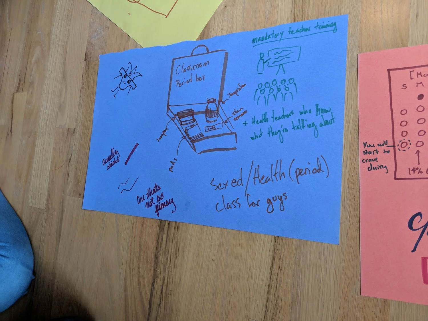
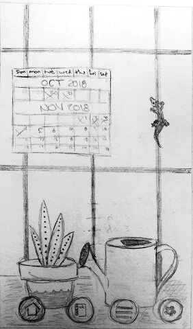
An idea sketched by one of our focus group participants
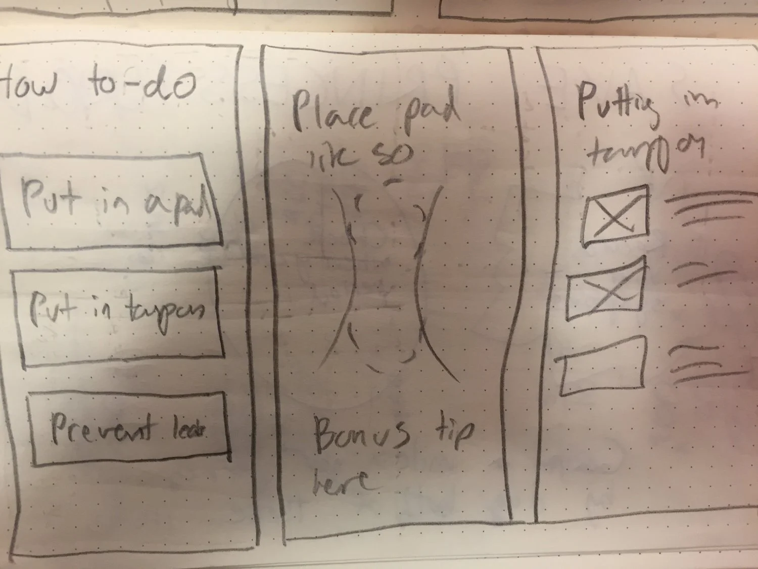
The next step in our design process was to ideate and come up with three ideas that could potentially be used. The first thing that my team did was to make ten sketches individually, basing our sketches off of the sketches that our focus group participants created. After we were done, we each presented our ten sketches to our team, going over the pros and cons of each sketch. Then, we grouped each idea into a whiteboard and began going over which ideas we wanted in our final app.
We decided that in our app, we needed to have a short FAQ about period terms and information about what users could do in order to help them cope with their period and symptoms, the app should track the user’s period and tell them on what days are they most likely to get their period (percentages). In terms of the ideas from the physical, aesthetic, and gamification, we chose the top ideas from each of these categories and put each idea into one of our final three refined ideas. The three refined ideas were, a detective themed app, a plant themed app, and a generic plant tracking app.
First Prototype
My team created low fidelity prototypes of our three main ideas, the plant themed app, the detective themed app, and the generic themed app. Our low fidelity apps were created through Sketch, creating drawings on paper and linking the screens on Marvel, and in Figma.
Then, we went through a peer critique with some of our peers in our class, having them review each of our low-fidelity prototypes to see what was good about the app, what we could improve on, which theme that they liked the most, and what they thought we could expand on more in the high-fidelity prototypes.
Low-fidelity screen of our detective themed app
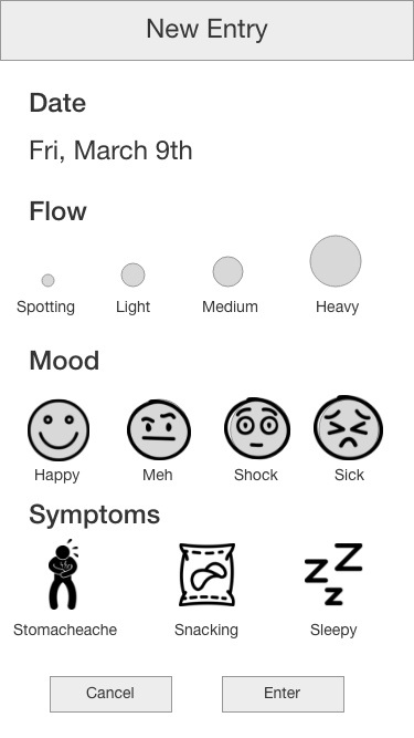
Low-fidelity screen of our generic period tracking app
Low-fidelity screen of our plant themed app
Second Prototype
The next step in the prototyping process, was to take the feedback that we had gotten from our peers and use it to create high-fidelity prototypes. Our high fidelity prototypes were created in Figma. When it came to which theme was better, our classmates were split between the plant themed app and the detective themed app. As a result, we made two high-fidelity prototypes, one that was detective themed and one that was plant themed app.
After we had finished our higher fidelity apps, we did another peer critique with our classmates, in order to see which improvements worked best, what could be improved on, and what theme they thought had the most potential. The main feedback from our peer critique, was that the visual design for both apps needed to be improved on and some of the concepts needed to be tightened up.
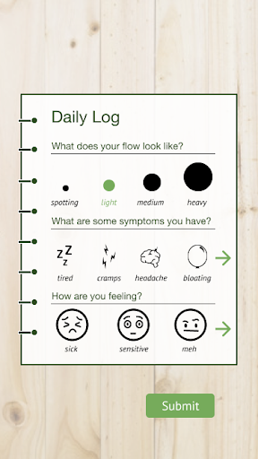
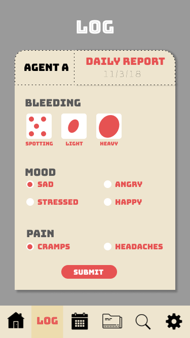
A screenshot from our higher fidelity prototype for our plant themed app
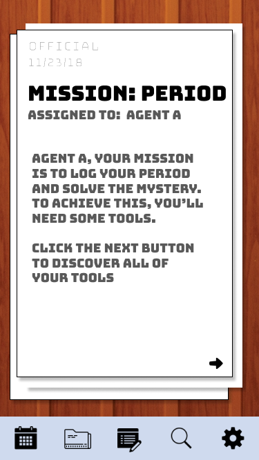
A screenshot from our higher fidelity prototype for our detective themed app
After completing our peer critique, we did usability testing on our target user groups. In each usability test, we had each participant do three tasks, (log their period, look up what PMS was, and check when their next period is coming). Then, we asked them what they thought of each task, what they thought could be improved, and which theme they liked better. Besides asking them what they thought of the app in order to get feedback from our user group, we asked them what theme they liked the best, as our second peer critique group was split between the two themes.
In our usability tests, our participants found the apps easy to use. However, they thought that buttons needed clearer labels and that some of the interactive features of the app, like the mystery aspect of the app, needed more detail in order to keep them engaged. Participants in our usability study were also split between the detective themed app and the plant themed app.
Final Prototype
Finally, we took the feedback from our peer critiques and our usability tests and refined our high-fidelity prototypes in order to create final versions of our apps.
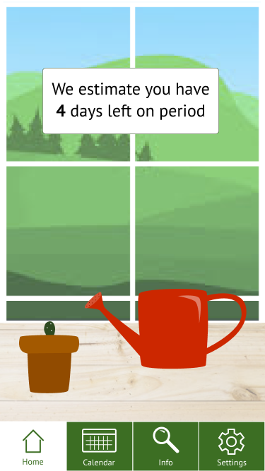
Home screen of plant app
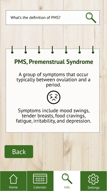
Information screen from plant app
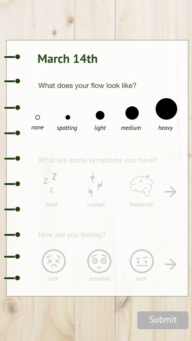
Logging period screen from plant app
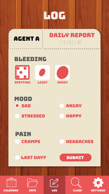
Logging period screen from detective themed app
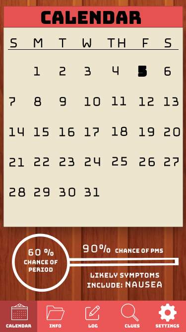
Calendar screen from detective themed app
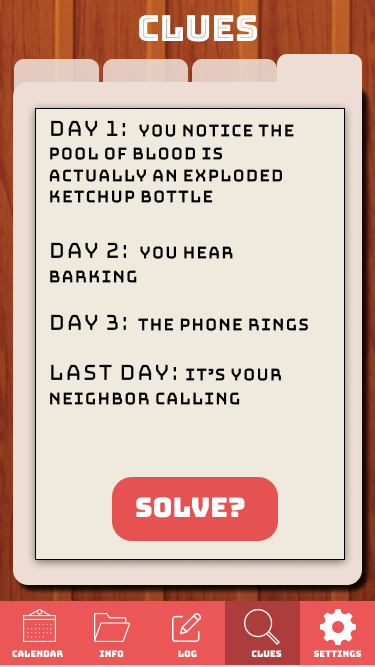
Clues screen from detective themed app
What Could Have Been Improved On?
Deciding on a theme early on. By focusing on one theme early on, we could have made one stronger app that went more in depth, that was built by all members of our team. We could have figured out the theme early on by doing another ideation session with our target user group.
If we had more time, we could add a functionality that allowed users to transfer their data that they logged into the app to another app as they reached adulthood.
Final Thoughts
Overall, I think we were able to meet our goals of our project - creating a period tracking app that is more centric on pre-teens. I’m pretty happy with the overall results and this definitely is a project I would like to pick back up in the future. I think this project fit in line with my goals as someone who creates projects that do social good and healthcare. I’m hoping I can work on projects like this one in the future. Lastly, I’d like to thank my teammates, Jill, Oorja, and Natalie, for being some of the best designers that I’ve worked with in my growing career!