Traces Homepage
The Traces homepage is an improvement to LogicMonitor’s current Traces functionality. The Traces page is a way for users to view their traces and operations of trace data from their instrumented applications. Users need access to this data, in order to identify where an issue is occurring in an application’s communication while the application is running. I was the lead designer on this project and primarily designed and researched the feature.
March 2022 to December 2022
Dates
Worked with…
Tools
Figma
Teammates
Bowen Cai (Product Manager), Greg Nudelman (Design Advisor), Lalit Shulka, (Senior Manager, Software Engineering), Ashish Ingle (Manager, UI Engineering)
The Problem
There’s a ton of data on the current Traces homepage - Currently, the Traces page consists of a table and a graph. The table currently shows every span that a user is getting from their instrumented Applications, which come in the form of an object in LogicMonitor called a Service. The graph shows the user what the overall performance of their Traces are. While there are filters that a user can use to narrow down their results and they can use the graph to filter down the table, there is still an overwhelming amount of data on the page.

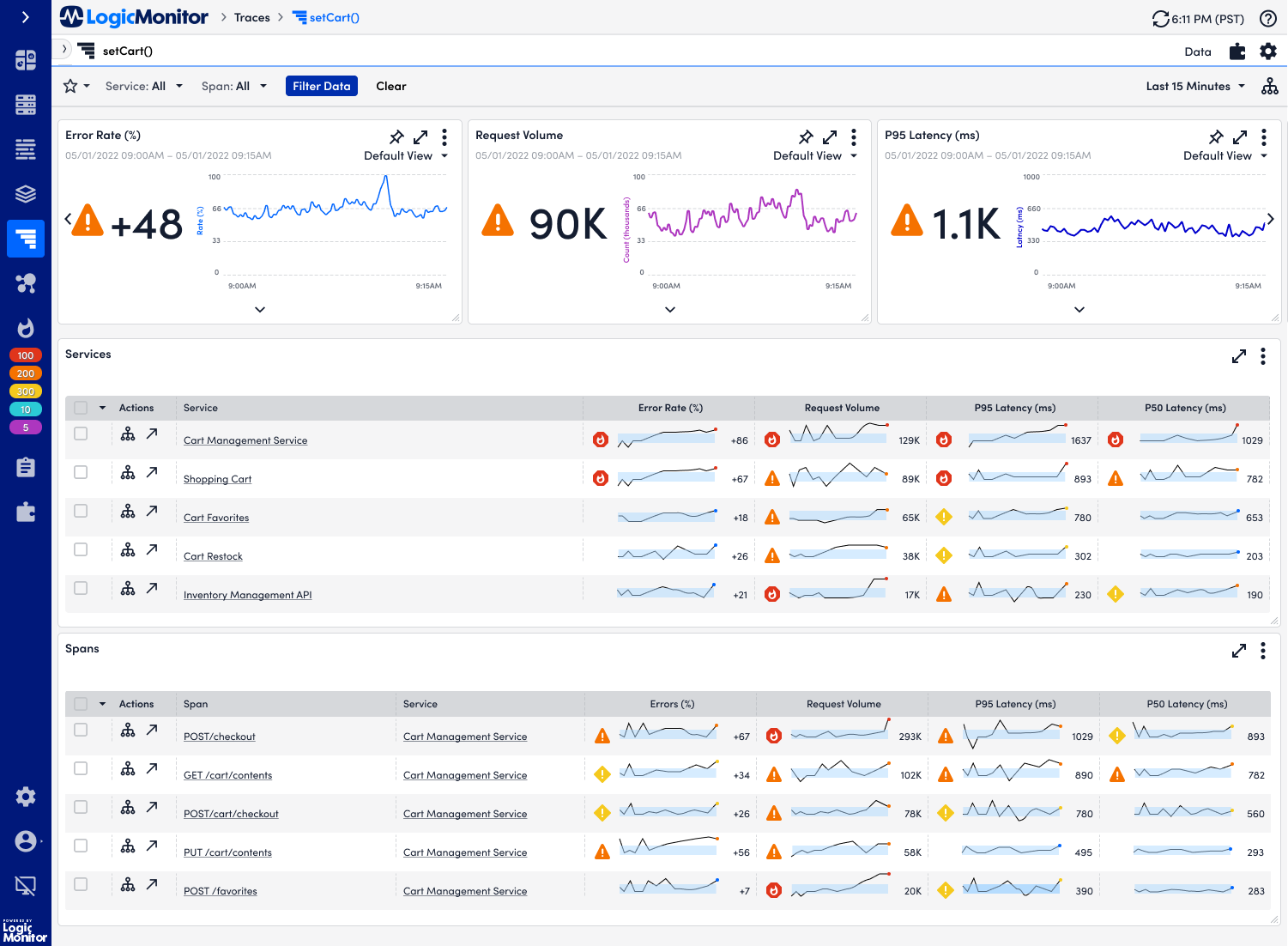
The current implementation of the Traces page.
Users need to know where to start troubleshooting - Due to the amount of data that is on the page, there’s no clear way for a user to start troubleshooting. Even with the addition of Traces Topology, a new feature where a user can view a high level map of the Trace services, it’s still hard for the user to understand which trace they need to start looking at, as multiple traces could have the same statuses.
There needs to be a high level view of what is going on holistically - Adding onto the complexity of the Traces page is the addition of the concept of a namespace. A namespace is an identifier that can apply to multiple Services. In the current product, it’s currently impossible to find the namespace within the product. Therefore, even if a user could pinpoint a singular trace that could be the cause of their issue, they might not see the whole picture, as they may be ignoring other trace data that comes from the namespace.
To create a homepage for LogicMonitor’s feature Traces, so that users can easily start troubleshooting and view the health of their namespaces.
The Goal
Journey Mapping
One of the first things I did was sit down with Bowen, the product manager and come up with a journey map based on previous research. The purpose of creating this journey map was to help me understand how a user would realistically be using the Traces homepage. I also wanted to figure out what data they needed to find within the Traces homepage.
We first started out with the most common use case and persona. We chose the realistic case of the manager persona looking at the homepage to check on the health of their services. Then, we created a high level map, which broke apart their experience into stages. Within those stages, I then mapped out the mood of the user as they went through each stage. Once we had mapped out the stages, I then focused on figuring out what they were thinking, what they were doing, what KPIs were they using during each stage, and how they were feeling.
Here were the key takeaways that I got from this journey map:
Users need to quickly look at the Traces page in order to understand the high level picture of what is going on with their namespaces
Users are typically looking at a namespace first in order to understand what’s going on broadly with the individual namespace.
The metrics that users really care about when they’re trying to troubleshoot are overall health (of namespace, services, and traces), latency, error rate, and request volume.
Ideation
For the Traces homepage, we had a couple of ideas and approaches that we could go for. The initial and easiest idea was to use components that were already in our design library and then display them as a dashboard. While I knew that using the widgets that we had in our library, would be the easiest solution for our engineering team to implement, it might not have provided the greatest experience for our users. Two of the primary reasons why I was concerned about if we were to choose this implementation, was due to the overwhelming amount of widgets on the page and the lack of connection between each widget. Because of these two reasons, I was concerned that users would be unable to interpret the dashboard.

The initial dashboard
Based on my initial hunches, I ended up coming up with two other alternatives that involved creating new components. The first alternative was coming up with a giant widget which combined a line graph and a table of values together. The user would be able to change the values by using filters on the table or zooming in on the graph. While this iteration was slightly better than the previous iteration, as it was able to give a more cohesive experience, I still was concerned with the readability of the dashboard. Additionally, considering it was a brand new component, I knew it would take more time for the developers to build.

The second alternative that I came up with was creating multiple table widgets with sparklines. The idea for the sparkline came out of prior knowledge from previous user research studies across our various products (such as the alerts page and the resources page) that users enjoyed data dense UIs. I also knew that while a sparkline would also provide a challenge for the engineers to make, it would be easier to implement than the other versions, as the only new component was one table cell.

When I presented these designs to the team, there was disagreement on how the approach should go. While there was agreement that having a generic dashboard wouldn’t be an ideal solution, some of the team thought that the mega widget was the right way to go, the other half of the team thought that the sparkline would be the ideal solution. Based on these conflicting opinions and being unsure about the overall experience of the product, I decided to conduct an initial usability test.
First Pass of Usability Testing
This first usability test was to help determine which design was easiest for the users to interpret the findings and start troubleshooting. Users were asked to find the service and namespace that were in the most trouble and explain why they thought the service they found was in trouble. Around 10 users were used in this study, all with a varying experience with APM. Below are the main findings from the usability study:
The sparklines had the most optimal experience- Users took the least amount of time to interpret the sparklines, taking around 3 minutes on average to find the service that was in trouble. Users cited the band around each sparkline and having the sparklines within close reading distance of each other as beneficial to their experience, as the band allowed them to see which namespace was exhibiting concerning behavior. They also liked how they didn’t have to constantly scroll back and forth to see and compare all of the metrics.
The dashboard with individual widgets had the least optimal experience - Users took the most amount of time to interpret the dashboard, taking on average 10 minutes to read through the dashboard and find the results. Even though they were able to read the dashboard and find which service and namespace was in the most trouble, they didn’t like that they had to constantly scroll up and down in order to look at the different metrics
Users were focused on namespaces - Even though all of the designs provided a clear picture of what namespaces, spans, and services were in trouble, users expressed that they also wanted to see all of their namespaces. They mentioned that when troubleshooting, they’re usually only care about the namespace, then they’ll go into the services and spans. They wanted to also sort their namespaces based on the request volume, errors, and latency. More importantly, they wanted more detail on the namespace itself.
Improvements and Changes
After I had completed my first round of user research, I had a better idea on what direction the homepage should go. The next thing I did was take the findings I had gotten from the research and turn them into a new design as well as complete the flow. I also added an overarching namespace view for the user. The reason why I added this screen, was to continue to fulfill the goal of allowing a user to have a high level view of a single namespace. Additionally, this page would give them more detail on the namespace itself. This change was also based off of user feedback that the namespaces needed to be front and center.

Initially, I decided to go with a similar approach to my previous sparkline design. Instead of showing a top five for services and namespaces, there were four widgets. One showing the highest amount of errors, latency, and requests. This change was done in order to give users a high level overview of the health of their namespaces.

I also decided to try out another version where it was a table listing out all of their namespaces. On each column representing a metric, there would be a sparkline present. I decided to try mocking this design up, based on feedback that users wanted to see all of their namespaces in one page.

However, after getting some internal feedback from the rest of the design team, I realized that this design was missing a couple of features. First, there was no way for the user to compare thier namespaces. Second, I realized that I may have been overcomplicating things. The next flow that I ended up making was similar to what we had implemented within our current Traces page, where there was a graph above and a table. The table would display all the namespaces. Then at the top, the user could toggle to see which metric they wanted to take a look at. I came up with two designs, one where the table would change when the user would choose a metric, and one where a user wouldn’t.

Prototype where table would change with the dimension change

Prototype with static table
Again, there was still disagreement within my team on what direction our homepage should go. Some thought we should try and provide an elaborate dashboard view, while others thought that we should do a simpler approach. I decided it was time to involve our customers again, in order to gain clarity.
Second Round of Usability Testing
In order to gain further clarity on what direction the homepage should go, I conducted another round of usability testing. Like the first round of usability testing that I ran, I asked users to find the namespace that was in the most trouble and explain why they thought so. 10 users participated, with varying experience in APM. Below are the key findings:
Users ended up ignoring the toggles - When users used the two designs with the toggles changing the header graph, the toggles were mostly ignored by the user. Users tended to glance at the graph for any common trends, but would mostly look at the table to see if there was any unusual metrics. I came to the conclusion that users would end up accidentally ignoring metrics if they were trying to troubleshoot using the prototype where the table changed with the toggles, they would not be as efficient in finding problematic namespaces.
Users preferred seeing a table with all namespaces - Users found the design involving the table listing out all of their namespaces and metrics was the easiest for them to start troubleshooting. They cited how condensed it was and how easy was it for the user in order to compare and contrast the metrics between namespaces.
Users thought the sparklines made it easier to interpret data - Users were able to easily compare and contrast between the metrics. For all of the flows involving the sparkline component, users cited the condensed data and ability to quickly compare and contrast, as factors to their enjoyment of the experiences. They also mentioned that the condensed page was an improvement in comparison to a larger dashboard. On the table design that had sparklines, though they were able to easily read it with a small number of namespaces, users were concerned that if they had 20+ namespaces, the amount of sparklines could be overwhelming.
The Final Iteration
Based on the results from the second usability test, I ended up going with a mix between the widgets and the table view. The widgets still would provide a general overview of the health of their namespaces, but users could also choose to view a table listing the health of their namespaces. I chose to omit the sparklines on the table, due to concerns about the overwhelming nature of the sparklines.
Another feature that I added was the namespace tree. This feature was a product requirement so that users could navigate back and forth between their namespaces without having to go to the homepage. The tree was chosen, as it was a pattern for navigating in between items that we had implemented across other parts of the platform, and we wanted to continue having a consistent experience. I also added in a little dialog where a user could choose a default view. This dialog was chosen, as we had implemented this pattern into other parts of the platform.
Lastly, one minor change that I had made was getting rid of the new window icon and just making the names of the namespaces links. This change was made based off a majority users citing that they would be more likely to click on the name to navigate to the namespace.


Once I had built everything out, it was time to sit down with the product manager and the engineer to determine what was features were feasible or not. Additionally, I wanted to ensure that key features were not being lost as we built this MVP.
One of the most challenging things that I had to go through during this MVP stage was determining whether or not we could build the trending view and the view all namespaces pages. Engineering was crunched for time and they only had enough resources to build one page, considering that all of the pages had new components. The major con of this constriction was that users would lose the ability to jump back and forth between each of the namespaces, if we did not build the trending view and the view all namespaces.
I needed to come up with a solution that was feasible enough for the engineering team to build, yet didn’t lose this functionality. I then asked the product manager the following questions:
How many namespaces on average did a user have?
Were users typically looking at multiple namespaces at a time?
Based on usage data and previous research, it happens that organizations only had a handful of namespaces (around five on average). Usually, one user was typically assigned to a singular namespace to monitor the overall health of it. Based on this information, I came up with a simplified version of the homepage, where it would default you to view a singular namespace. However, a namespace would always be selected. This option was the best option, considering that this would work similarly to our existing filters, which had been validated. Additionally, this would be relatively easy for engineering to build.

A user can change what namespace they are viewing data for using the filter shown above
The next major change made to the MVP was getting rid of the alert markers. It turns out we couldn’t add in the alert markers for each metric that was displayed in the sparkline. We ended up showing the overall status of the service. This decision was based on re-reviewing user research and use cases, as we found while users did care about the status of the metrics, they cared more about the overall health of the service. In order to help alleviate any confusion, we also added in the total amount of active alerts for a service.
This next major change was made while the engineering team was working on it. I had to change how the spakrlines were displayed. The frontend and backend engineering teams had difficulties efficiently loading up all of the sparklines on the table. It would take around 30 seconds to a minute for the sparklines to load on screen.

The homepage of the MVP
The temporary solution that we would implement for now (while there was still backend work being done to improve performance) was to do a toggle. The very first row of the sparkline would be visible in order to ensure that users could see that there were sparklines available to see. A user could toggle on and off sparklines if they chose to. If they wanted to turn on all of the sparklines, they would receive a warning about the load time.
The last major change was getting rid of the spans table. Due to the backend still needing to take the time to figure out what data should go in the spans table, we ended up getting rid of the spans table for the initial MVP.
Aside from those changes, there were only a few minor ones, such as changing the column names and removing nice-to have widgets.
Once the MVP was finalized, the engineering team was able to start developing it.
Spec Sheets
In order to help the frontend engineering team ensure that they were creating the right components, I also ended up building spec sheets outlining what the combo widget and sparklines look like and how they should be used, as some other designers working on dashboard related features wanted to reuse these components in their designs.


Right now, the design is currently being developed by our engineers. As it gets built into an MVP, here are some additional features that I’ve been thinking about for future releases of this feature:
Reintroducing the sparklines back in the “All Namespaces” table - Even though users were concerned if there was an overwhelming amount of sparklines when there are 20+ namespaces on the table view, users did mention that they had no issues if there was less than 20 namespaces on the page. One thing that I will have to evaluate in the future is whether a user would want to choose to enable sparklines on the table displaying all of their namespaces in the future.
Customizing the homepage - There was a question from the team on whether or not the users would want the ability to customize their homepage with different widgets. There’s still some more research and ideation that needs to be done around this.
Using this as a kickoff for a general APM homepage - Tracing is only one part of our APM suite. The APM suite consists of Synthetics monitoring, OpenMetrics, and Traces. There’s also features such as Logs and Services that help support APM functionality. Currently, the APM experience is disjointed, as there is no central location for users to view all of their APM features. While this is only a small part of the suite, hopefully these designs can be used as a start to the ideation for our APM suite.