Usability Study on TripAdvisor
This study was a 10 week usability study that I did with three other teammates. This usability study was intended to evaluate the usability of the website TripAdvisor.
Are users able to efficiently find experiences on the website that appeal to them and purchase them smoothly?
Which interactions are causing the most frustration for users on the website
Research Questions
Worked with…
Tools
UserZoom, RealTime Board, Paper and Pencil
Teammates
Study Plan
The first step in our process was to create a study plan. The purpose of creating a study plan was to map out what our usability study process would be. In this study plan we included the research questions that my team was going to focus on during our usability study, what methods were going to use during our study, what the main tasks we were going have our participants do during our study, how we would collect our data, how we would evaluate our data, and how we would present our findings. Overall, this study plan was designed to help guide us throughout our study.
Test Kit
The next step in our process was to create a test kit. Our test kit was a collection of all the materials that we would use during our usability study. In our test kit, we have items such as our consent forms, our participant screening surveys, and the protocol we would use during our sessions. By having our test kit made in advance, we were able to make sure that we were able to keep our sessions with our participants consistent.
Conducting Tests
We conducted ten usability tests, each session lasted around thirty minutes to an hour. Each session was done on UserZoom. During each session, we had one moderator who would be running the study and one notetaker who would be taking quantitative data (which included the number of errors) and qualitative data. First, participants would be asked about their travel habits and what they do to plan out their trips normally. Next, each session had each participant complete the following tasks to complete on TripAdvisor:
Purchase round-trip flight tickets
Find a hotel within the user’s budget that has all of the amenities that they want
Create a list of fun activities/events to do
Find a structured guide that has a TripAdvisor users’ travel recommendations for three days
Make a reservation to a highly rated restaurant and to check if that restaurant has good service
After each questionnaire the participant was asked about what they liked about the task, what they disliked about the task, and what part of the website they wished could be improved to make their experiences better. When participants had finished completing all the tasks, they filled out a post-task questionnaire and they were asked what their overall experience using TripAdvisor.
Analyzing our Data
When we had finished completing our usability test sessions, we started to come up with our findings through affinity diagramming. We chose to do affinity diagramming, because felt it was the best method to find themes.
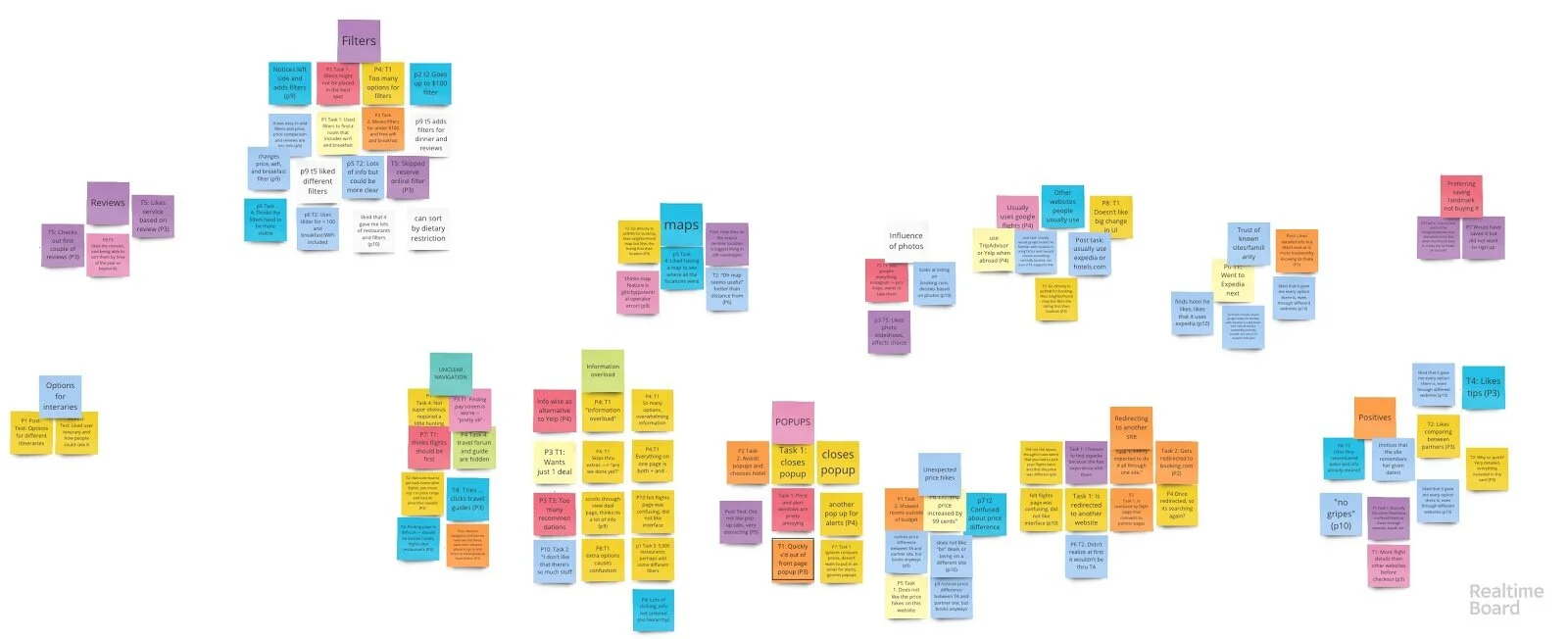
Our affinity diagram
Besides affinity diagramming, we also analyzed our quantitative data that was gathered from our post-task questionnaire to get a further understanding of what the common feelings of our participants were.
Findings
Through our analysis we were able to come up with the following positive/neutral findings.
Use of Filters to Specify Search Criteria - When the filters were noticed and applied, users were pleased with how effective and comprehensive they were in narrowing down their results to exactly what they requested.
Influence of Photos - Participants were either neutral or positive towards all of these photos throughout the site and they influenced their decision on booking or ignoring an attraction.
Informative Reviews - Generally, these reviews were deemed helpful and informative by participants when they were booking events.
Remembering Information Across Site, Continuity - The site was relatively consistent in holding onto relevant data and showing suggestions for events based on travel dates inputted in by participants
We also found the following findings that showed potential issues that could be fixed by the TripAdvisor team:
Unclear Navigation - Throughout Task 4 in particular, finding a travel guide, many participants struggled with finding the correct section due how to it was the only task that didn’t have a high priority navigation button.
Disabled Button - A bug where the combination of clicking on the compare prices on every site and put in an email to receive price tracking updates these two features disabled the “search flights” button.
Redirecting to Another Site - Participants were redirected to other websites after choosing a flight/hotel to confirm and pay for their bookings.
Information Overload - The way that some of the pages were designed and how the text on the page was formatted would overwhelm users
Unexpected Price Hikes - Participants noticed prices on the partner sites being higher than they were on TripAdvisor, some by a considerable amount and some by a small amount
Pop-ups - Participants explicitly mentioned their dislike for pop-ups when pop-ups appeared on the screen
Maps - Some participants ran into issues using the map and felt it could be improved
Preferring Saving Landmark, not Buying it - Only some activities did not have an option to add to the cart, and participants would have to create a TripAdvisor account if they wanted to keep track of that activity. Other activities, participants had to buy from a package.
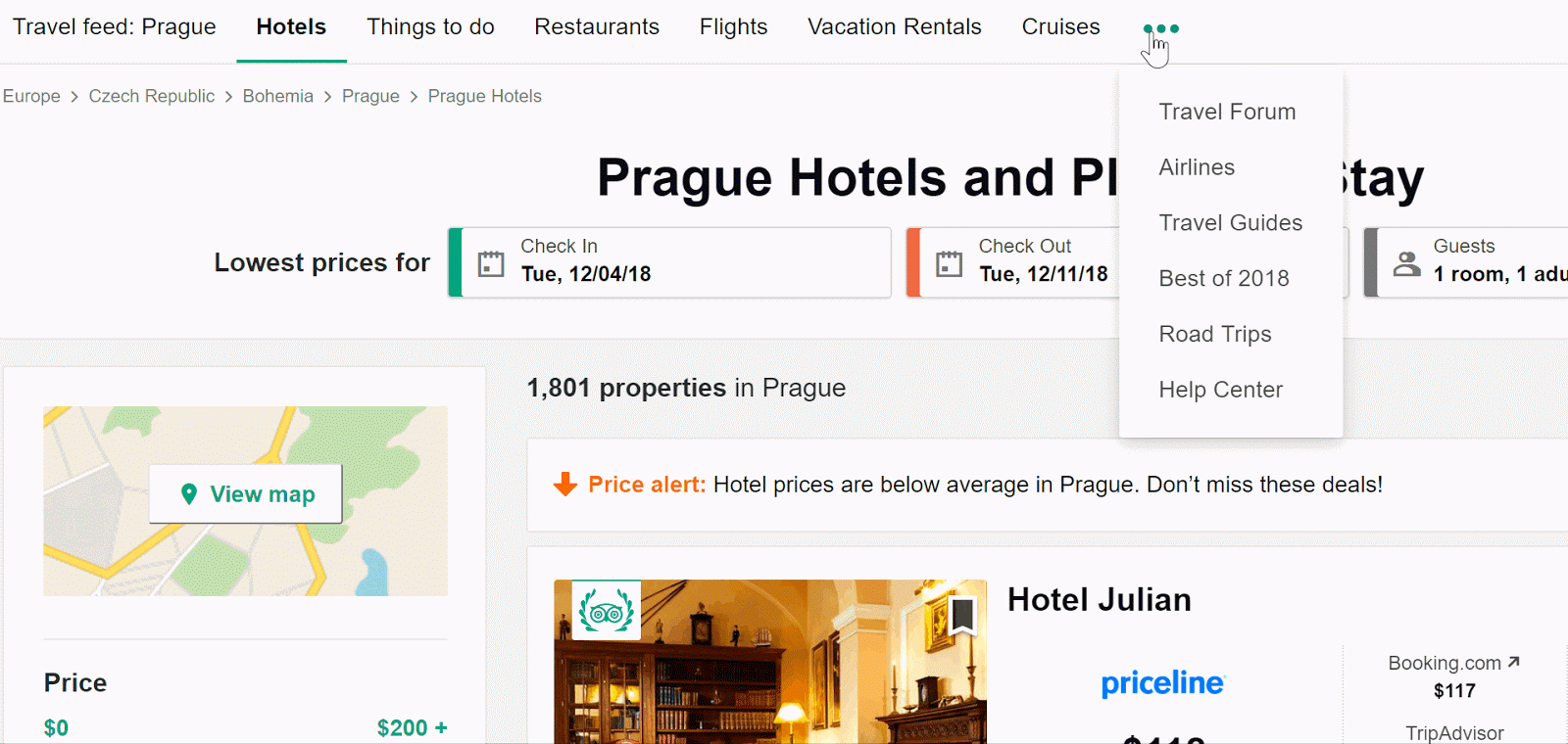
Current Navigation of Trip Advisor
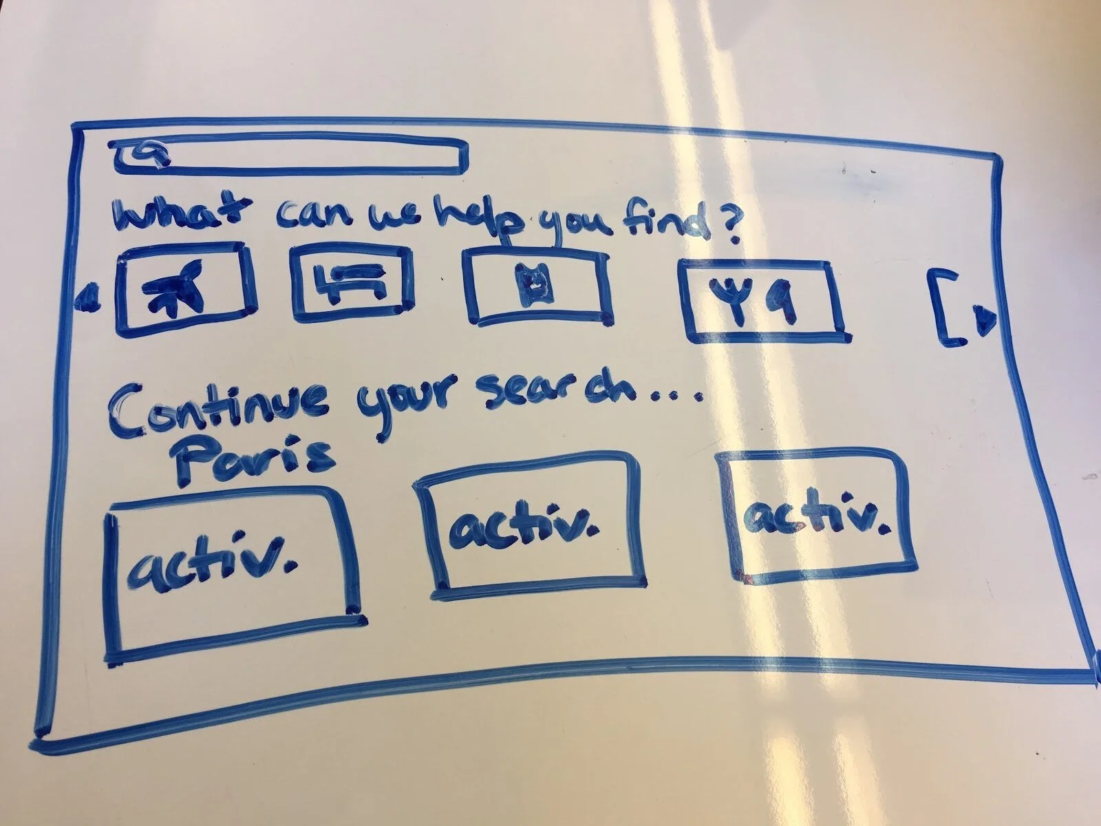
A sketch of a design recommendation to fix the information overload
The last step in my team’s process was to present our findings to our professor through two mediums, a presentation and a final paper. The presentation was designed to give an overview of our research process and our findings.
The presentation was ten minutes in length. First in our presentation, we went over the product we researched (TripAdvisor), the target audience we were focusing on, and the research questions we covered, the methods we used during our study. Next, we went over the positive/neutral findings from our study. Then, we went over the findings that presented certain issues that our participants encountered during our study.
For each finding with issues that we presented, we had a short clip of a participant struggling with the issue. After showing the issue, we presented our design recommendations to fix the issue.
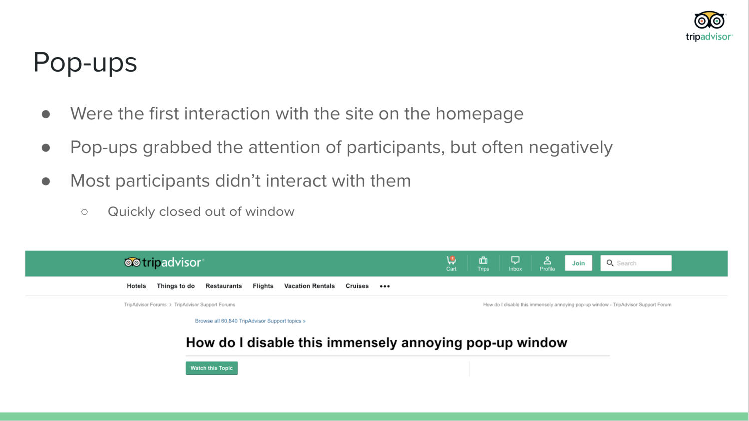
A slide explaining a finding that showed potential issues
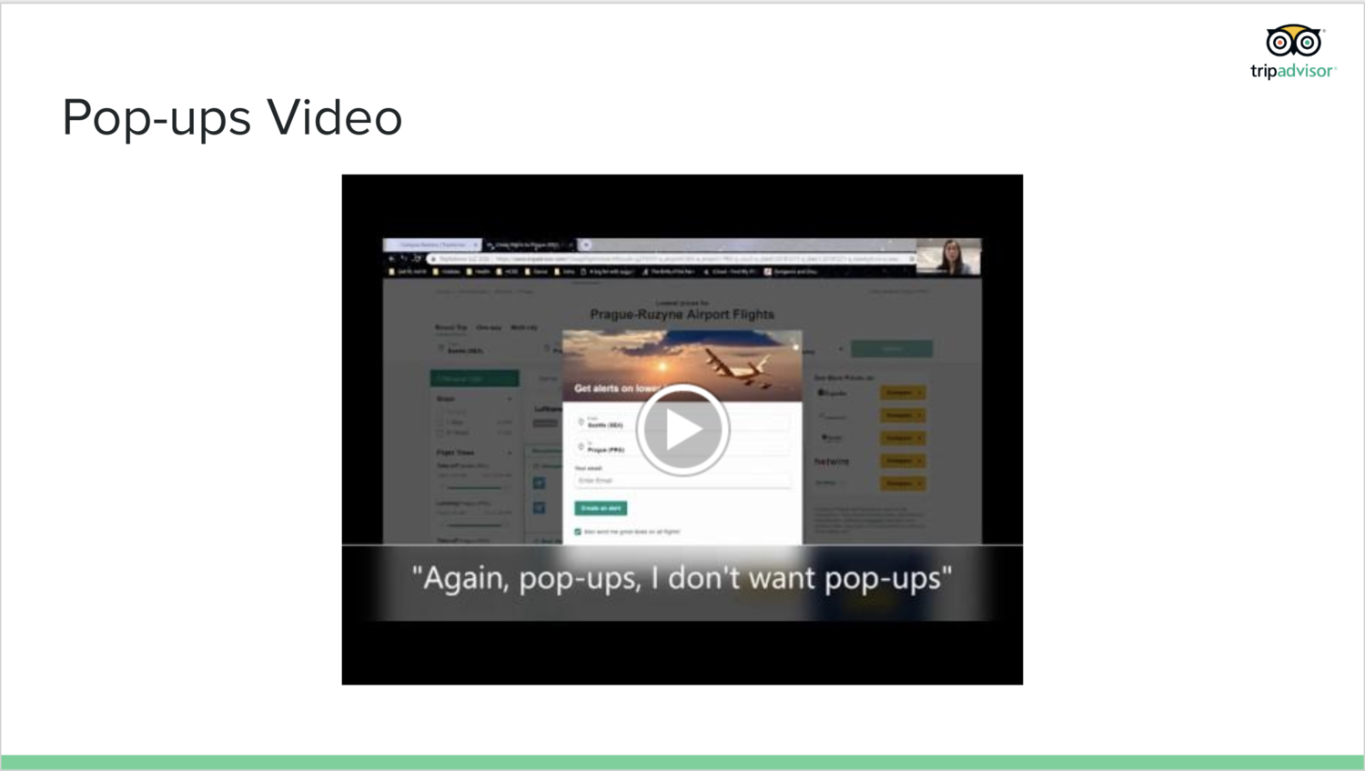
A slide with a video of a participant struggling with the issue mentioned previously
The final report was meant to cover the same material as the presentation, but it went more in detail than the presentation. Similar to the presentation, it went over the research question we focused on, the methods that we used, our major findings, and our design recommendations. In our final report however, we included our study plan, our test kit, and the data collected and analyzed in our appendix.
Final Thoughts
Overall, this study was a good way for me to practice conducting usability studies, as I know in industry, conducting usability tests is one of the main tasks that UX researchers do. I had fun learning more about TripAdvisor’s UX and how to evaluate the usability of websites and products. In the future, I’d like to do more usability tests centered on evaluating the usability of physical prototypes or doing usability study on a specific feature on a website.