APM Vision Prototype
One part of my job is to make high level vision UX designs in order to guide the direction of the product. Recently, I was asked to make a vision prototype that would guide ideation on what a unified experience for our Application Performance Management (APM) package might look like. I was the primary UX lead on this project, where I was in charge of leading discussions, coming up with the architecture of the project, compiling the prototype, conducting usability tests, and presenting findings to leadership.
June 2022 to July 2022
Dates
Worked with…
Tools
Figma
Teammates
The Problem
Users need a central location to view their application health - Most APM use cases, especially those concerning troubleshooting centers around App Stack. Users wanted to look at the high level overview of the app stack and then drill down into the details of the health of their app stack. As of right now, they are unable to do so considering that their app stacks can be found in Services, but there is no clear differentiator from an app stack vs a service. Additionally, in order to get any further detail, they had to go to separate areas of the product
The Application Performance Management (APM) features are scattered - LogicMonitor has a set of features that are under or related to their APM package, but all of them are disconnected from each other. Topology, Synthetics, and Traces are all on separate pages that have no clear way of showing the user that they are all connected. As a result, users who have started using APM expressed confusion on how they can use these three features together.
The vision for APM needs an update to match the company’s goal of a unified platform - When APM was first announced, I created a mockup that was shown at the company’s 2021 kickoff that showed the vision of what APM would look like in the product. However, it had been over a year since I had made the mockup, the mockup was admittedly a bit of a rushed job with little to no research, and the company’s goals were changed, with a bigger emphasis on a unified platform than before. The vision for LogicMonitor’s APM package needed to be updated in order to be aligned with the company’s direction.

A screenshot from the old vision prototype created in 2021
To show an updated envisioned experience of APM in the product that was aligned with the company’s goals of a unified process and would be used as a starting point for future projects in regards to LogicMonitor’s APM functionality.
The Goal
Ideation
The first thing that my team and I did together was to analyze the mockup that I had made in 2021, some of the existing features that we were working on, and some features from competitors in order to determine how we could get started building a unified experience. The competitors we mostly looked at were DataDog and Instana.

Below were some of the key takeaways from our analysis of competitors, implemented product, and vision prototype.
LogicMonitor is very bottom up at the moment and there’s no clear top-down structure. There’s a ton of features that feed into the unified APM experience but there’s no way of connecting the dots together.
DataDog had a solid base for showing a high-level topology and showing metrics, while Instana had a great way of showing the top-down structure of a user’s applications
Application Topology and some initial designs for the Traces homepage were built out enough. Their existing designs could serve as starter bases for the app stack homepage and the topology overview.
Synthetics is the most disconnected APM product. We needed to have a way for users to easily see how their synthetic transactions relate to their applications, services, and traces.
We needed a way for users to determine how many metrics they were using and how much their metrics were costing. APM is fully centric on metrics and one concern that users had was that they might be using too many metrics. The competitors we analyzed didn’t have a very clear way of showing their cost of metrics.

The user flow that we came up with
After our analysis, I led the creation of the user flow. This stage was particularly difficult because we had just finished doing a competitive research analysis, so a good portion of my team was caught up in ideating on features. Feature ideation isn’t a bad thing, but we didn’t have a big picture at the moment. As a result, I had to ask them to pause on ideation, take a look at the use cases that product managers had given us and get started on ideating on the user flow.
While building the rough user flow, we spent a good amount of time looking at existing documentation (such as journey maps from the Traces Homepage), user stories, and FigJam boards from previous ideation sessions in order to understand what the primary use case would be for the APM homepage.
We ended up centering our primary use cases on browsing the health and troubleshooting. We chose those two use cases as most of the user stories either focused using features under the APM package to troubleshoot problems with their applications or having a manager view the health of their applications as part of an routine checkup.
The use case on troubleshooting focused on diving deep into a problematic application and then going down several levels to determine what was wrong. The use case on the routine checkup focused on viewing the high level overview of all of the features and determining how much it was costing their company.
We also discovered through our analysis of documentation from product, that we wanted to introduce the concept of an app stack sometime in the future. The app stack would be used as an aggregate of services, specifically application services (as LogicMonitor has two different types of services, application and infrastructure). Considering that services were aggregates of datasources and resources, we determined that the app stack could serve as the top most level.
Once we knew where the top level was, I started to build out the information architecture. Using our previous knowledge and the information we had gathered previously, I was able to determine what features would be related to each other and how they would be related to each other. By mapping out the IA early on, it provided a structure of what the experience of using the APM homepage would be like. Additionally, my team was able to get clarity on how the features under the APM package related to each other.

Brainstorming the information architecture
Building out a rough IA helped us solve one of our biggest problems - figuring out how we could create an experience that showed how all of these features worked together. Specifically, this helped us figure out how synthetic transactions worked with Topology, Services, and Traces.

The rough information architecture that we mapped out
Once we mapped out the user journey and the rough draft of the information architecture, it was time for the team to get started on designing the first iteration.
The Prototype
The team and I decided to divide and conquer on the prototype, as it would allow us to quickly finish the prototype faster and each of us had specialized in different APM features (Keith was the lead designer on Topology, while Frances was the lead designer on Synthetics). In addition to building out the screens related to applications, services, costs, and traces, I was in charge on making sure everyone got their designs added to the mockup in time and ensuring that the experience of the mockup matched what we had put in the user journey.
The use case centered on browsing health was captured through the primary homepage. The primary homepage had multiple tabs where user could view the overall health of their applications, services, topology, synthetics, and traces. We also added in a spend page, as in the use case for the manager, they wanted to track the cost of APM features for their company.


For the use case on troubleshooting, we had users go to an application and then dive into several levels underneath the application to determine what was wrong.


Once we completed this, we presented the flows to design leadership and product leadership for additional review. Leadership overall thought that this was a great start on a unified vision, but we needed to get additional information from customers, to ensure that this experience could work for them and to guide further development of the product.
User Research
I conduced a two week usability study in order to evaluate whether or not the proposed design would meet the needs of existing APM users, encourage newer users to try out APM, and whether the design created a unified and cohesive experience for users. Fifteen different enterprise level users were interviewed, all with varying experience with APM.
During each interview, users were asked to complete the following tasks:
Determine what the overall health of their applications were
Determine which application had the most issues and figure out what was causing those issues
These two tasks were chosen in order to determine whether or not they were meeting the use cases we had outlined in our ideation phase. Once they had completed their tasks, they were asked about their experience, in order to determine the ease of use of the homepage.

After the interviews were complete, results were synthesized using a modified affinity diagram. First, all notes were placed on pages where they were relevant, then an affinity diagram was created. The affinity diagram was then analyzed to come up with findings.

Here were the main takeaways from the research:
Users found the homepage helpful as it allowed all of the features to be front and center. There were multiple entryways for users to get started troubleshooting
This homepage would encourage users to try out APM, as there were high level overviews of topology and their applications provided at the homepage. They also enjoyed that there were multiple entryways to start troubleshooting
Users were able to easily determine which application was in trouble and determine why it was in trouble, due to the various amount of data from Services, Topology, Traces, and Synthetics.
The costs tab was the only part of the homepage that felt disconnected. Everything else felt connected to each other.
All findings and designs were documented in our research repository. Then, we presented our research findings to UX and Product leadership. After review from leadership, our next step was to meet with the APM mission teams to analyze the research and findings and determine what tactical projects we could build based off of these artifacts.
What’s Next?
This design has not been implemented, as it was designed for discussion. But there are parts of the prototype that have been taken and put into more tactical short term projects. Below is a list of some of the major projects that are using this prototype to help with brainstorming, discussion, and ensuring that they are aligned with the company’s goals and the rest of the product’s experience:
The Product Led Growth (PLG) mission team has recently implemented a usage page that monitors the data usage and costs of Logs and Traces. The design for costs tab was taken by the lead designer, one of my direct reports (Craig Melendes), and modified to better fit the direction of this project. I serve as the design advisor for this project currently.
The Topology mission team is currently brainstorming and ideating on improving Topology’s homepage to show a unified experience between application and infrastructure topology. We’re using the topology overview designed in this prototype, as a base for ideation.
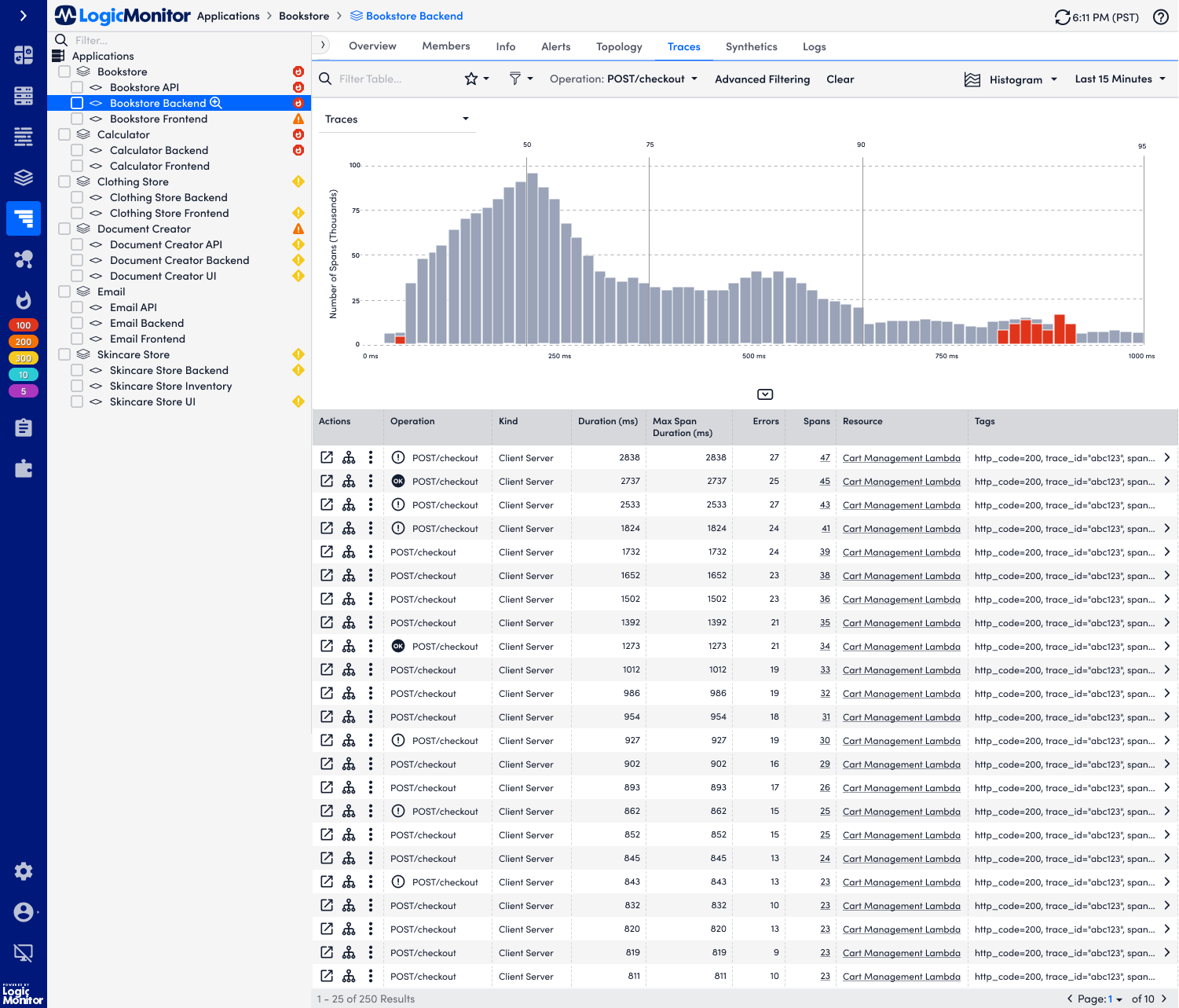
The Traces team wants to bring APM topology forward on the traces homepage. We’re currently in the middle of brainstorming what that might look like on the traces homepage, using this mockup as a potential example of what it might look like.
The Synthetics team is working on features that explicitly connect it to the Traces homepage. Yiyan and I are using this prototype for design inspiration and starting discussions on what the integrative features would look like.
I also plan on further refining this prototype and the information architecture, with guidance from product, UX, and engineering leadership, as we start planning UX work in 2023.