SafeTastes
Safe Tastes was an app that my team came up with for our INFO 102 class. Safe Tastes is an app that allows users who have allergies to find restaurants that have allergy-safe options for them, and allow them to find restaurants that they want to eat at. Check it out here!
I decided to redesign the app in order to match the style of the website that we chose to present our process, make the app more user friendly, and to address design issues that my instructor noted that we needed to work on.
Tools Used
Balsamiq, Adobe Illustrator, and Adobe XD.
Teammates
N/A
User Research
Before my team did any design work the first time, we did user research in order to see what potential problems our users faced. Specifically, we wanted to see what pain points they faced and what they might want out of a technology. For this redesign, I chose to use information that we had already gathered from our initial user interviews, to help me get started.
Summary of Interviews:
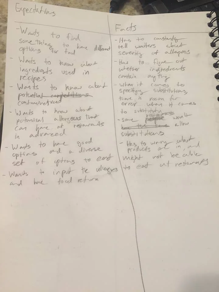
The interviews we conducted confirmed our belief that eating out at restaurants is difficult and nerve-racking for people with food allergies. We learned in depth what a typical experience at a restaurant for someone with food allergies is like. A typical individual with food allergies faces many challenges before even sitting down with family or friends to eat. Potential users said that finding restaurants that accommodate their allergies was time consuming. Users have to research the facility in which the ingredients were manufactured in, if the restaurant itself is aware of precautions that need to be taken for individuals with food allergies, and what ingredients are in the dishes. Other issues arise when it comes time for individuals with food allergies to actually eat. Some of them include, a possible contamination of food, misinformation from waiters or chefs, and even mislabeled ingredients. People with food allergies appear, in large part, to be a misunderstood and underrepresented group. The average person is unaware of the potentially fatal consequences of unintentionally contaminating food. An application to aid individuals with food allergies is not only necessary for matters of efficiency but for matters of the health and safety.
After doing the interviews, I wrote down a list of expectations and facts that were taken out from the interview, in order to help shape my personas needs and wants.
Personas
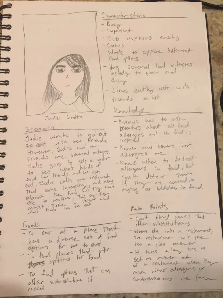
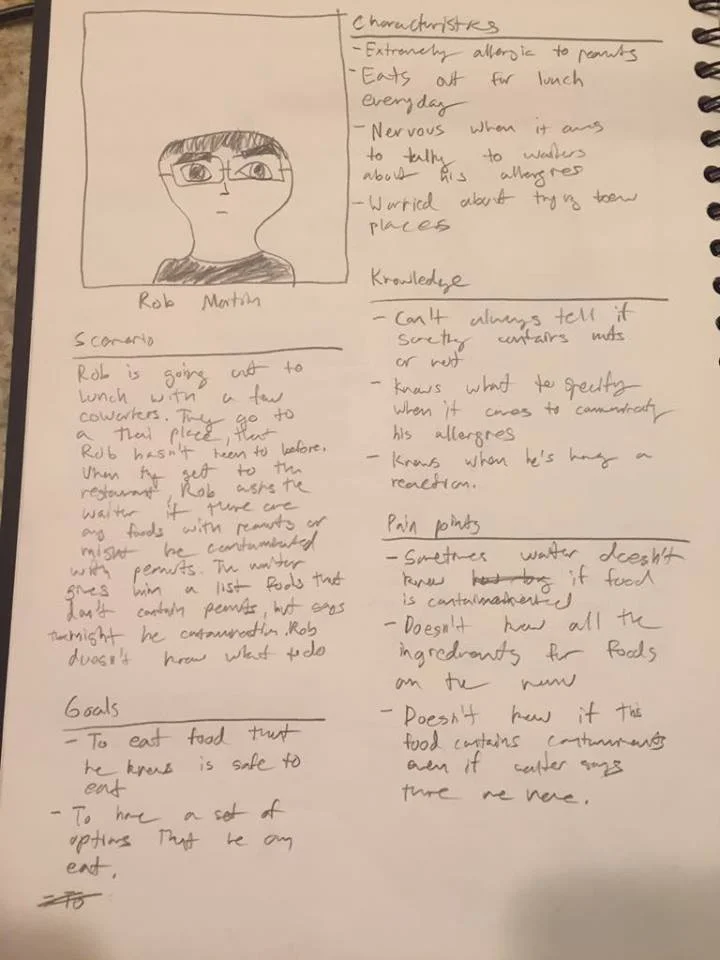
The next step in my design process was to come with two personas, in order to figure out who the app's users were and what their goals/difficulties were as a user. I then created high fidelity personas, to tell who my users were and what they need help with. By establishing personas, I began to work on user journeys in order to determine what a day in the life of a user might be.
First provisional persona

First polished persona
Second provisional persona

Second polished persona
User Journey
The next step was to create a user journey for one of my personas. I chose to focus on Rob for my user journey instead of Jodie, because of his characteristics of having more severe allergies and having problems such as worrying about contamination, while Jodie only focused on finding dishes that didn't have the allergens. By creating a user journey for the persona, I was able to capture his daily life and all of his emotions that he felt throughout the day.

By creating a user journey that highlighted the pain points of the user, I was able to come up with design requirements for the product that would help solve the user's problems.
Design Requirements
After I had finished mapping out the user's moods, story, and pain points on the user journey, I created the design requirements for this product, that would solve the problems that users faced on a daily basis.
Design Requirements
Give users a variety of options based on location and a keyword (type of meal, a type of cuisine, name of restaurant, ect.)
Show users what they will be able to eat on the menu of a restaurant
Alert users of potential risk of contamination in a restaurant
Allow users to post reviews for feedback of customer service and accommodation of allergies
Shows users the contact information about these restaurants
Allow users to input their allergens into their profile, which will allow them to filter results automatically
Be able to allow users to filter based on not just allergies, but dietary restrictions such as veganism
Provide recommendations for user based on their search history, location, overall rating, and the number of options a restaurant offers
By creating design requirements, I would be able to start on drawing storyboards that highlighted the issues that users faced, and demonstrated how the product could solve these issues.
Storyboards
After I finished my design requirements, I created storyboards to demonstrate how a user could solve problems that they faced with the product. Drawing storyboards not only allowed me to show how my product could be used to solve problems, but to demonstrate what my product's UI could potentially look like.


By creating storyboards that demonstrated different usages for my product and what functions my product could have, I was able to create wireframes that demonstrated what my product would potentially look like, and how the functions would work. The storyboards also allowed me to figure out what some of the key tasks were that I could get started wireframing on the UI for the app
Wireframes
Creating wireframes allowed me to get an idea of how the app would look and what the UI would be. By creating wireframes, I was able to flesh out how these screens would look and what the interaction between the screens would be. I only created the wireframes for key interactions in the product (such as finding a restaurant), and didn't choose to add any login/landing/sign up pages at this stage in the design process.


Now that I had created initial wireframes for my product, my next step was to test out my wireframes to see if users were able to complete the key tasks.
First Round of Usability Testing
In order to test out the usability of this product, I ran usability tests. For my usability tests, I had my users complete three tasks:
Find a restaurant
Write a review for a restaurant
Change your allergies you have listed in your profile.
While they completed these tasks, I made observations based on three different categories:
Did they take the right steps to complete the task?
Did they show any signs of confusion when it comes to completing the task
Quotes based on what the user was thinking
After the user completed the task, I asked the user to rate the task. After the user completed all of the tasks, I asked the user to write down some of their final thoughts on a separate piece of paper.
For the first task, here were common problems that my users found:
Needs more filtering options to it such as filter by cuisine/allergies etc
Seems like you need to know what you need to find in advance, such as the restaurant name
The home page and results page seemed a bit cluttered
For the second task, here were the most commmon comments that my users had
Restaurant profile information is nice and concentrated
Writing review is also very simple and straight forward but it was not clear if the review can be updated.
Reviewing is clear and concise. Easy to find
For the third task, here were some of the most common comments my users had
Would like to tap on the allergies itself to directly edit it
Any edits that could be made there could easily be edited in the profile page itself.
Editing allergy profile seems to take one additional step to edit vs. in place editing is probably easier to do.
By running usability tests on my wireframes, I was able to figure out what some of the issues were with my design in terms of usability. By determining the problems with my design, I was able to determine what changes I should make to my design in my high fidelity mockups.
High Fidelity Mockups
Based on what my users had told me in my usability tests, I was able to make changes to my design that would improve the user experience of it. These changes were implemented in the first step of designing my high fidelity mockups, drawing out the framework. After drawing out the framework of what my app would look like, I started to add fine details to my app in order to make it come to life.
For the overall visual design of the UI, I made sure to follow the iOS style guidelines (I used this style guide as a reference and the Adobe XD UI kit for iOS to make sure I got every single detail pixel perfect). However, I made sure to not to let it get in the way of my creativity, and added on to the iOS style guidelines, without trying to deviate from it. In order to determine what colors/what fonts/what overall visual style I should add on to the iOS style guidelines, I went on Pinterest not to look for UI that has already been done (A piece of advice that was given to me by a UX designer from Amazon), but to look for inspiring photos of things that wouldn't be typically associated with an app. I chose to focus on restaurants and some menus (I tried to avoid menus due to a menu being a type of interface, from a certain point of view), in order to get inspiration for the visual style of the app (Check out my inspiration for the visual style of my app here).
After determining the visual style of my app, I mocked up my entire system. I'm only showing some mockups in order to demonstrate the main features of my product.


By creating these mockups, I was able to get a full picture on what my product would look like. The changes that I implemented in these mockups would also allow me to do another usability test would also allow me to see if the changes made it more user friendly and to see if the visual design was pleasing to my users.
Second Round of Usability Testing
In order to see if the changes I had made to the design in the high fidelity mockup were effective, I ran another round of usability testing. For my usability tests, I had my users complete three tasks:
Finding a restaurant called "Pineapple Express"
Write a review
Edit your allergy settings
During these usability tests, I found that the changes I had made had solved earlier issues that had been seen in the first round of usability testing. However, I found that there were some overlooked issues that were in the product, such as the user being unable to find the search button, or exit out of the search tab. Based on these issues, I was able to see what changes I could make to my high fidelity mockups.
Final High Fidelity Mockups
After I had finished writing the report for the second round of usability testing, I implemented these changes, based on the overall results of the usability testing:
When the user goes to the search tab, the keyboard won’t pop up right away, with the user having to tap on the search bars to search
Adding a back button for users to exit the keyboard from the search
Adding dates to each review in the individual view
Changing “allergies” to “dietary restrictions”
As a result of these design changes, these were these were some of the final high fidelity mockups that were produced.


By implementing these changes to my high fidelity mockups, I was able to take what I had learned from the usability tests and translate it into the final designs.
Icon Work
The last and optional step that I took to completing this project was to design an icon/logo for this product. I designed a logo that could be used in marketing materials and an app icon to see what it would look like hypothetically on a user's home screen, using Illustrator. For the app icon, I used the iOS icon guidelines and this template to create it.

What Could Have Been Improved on?
I think the only things that I would have wanted to improve on this project was to do more user research and more usability testing in order to see if the design changes I have made were effective. I would have also added more tasks that each user would want to complete in the usability tests.
Final Thoughts
Overall, this was a fun project to work on in my spare time. Not only was this project a good way for me to practice going through the User-Centered Design process, but a way to improve on an old project. I also got the chance to work with some technologies I really wanted more practice in, such as Illustrator. After I did this project, I feel more comfortable doing mobile design and I feel more comfortable stretching my creativity, even though I have to work within a certain type of guidelines. I would like to do more projects around consumer facing products in the future in order to see what the similarities and differences are in designing consumer facing products.
Try it Out!
Did you like this project? Check out these then!

Period.
But First, Coffee

Certior